Sample GDP analysis

GDP components over time and among countries
UN_GDP_data  <-  read_excel(here::here("data", "Download-GDPconstant-USD-countries.xls"), # Excel filename
                sheet="Download-GDPconstant-USD-countr", # Sheet name
                skip=2) # Number of rows to skip
Tidying the data
tidy_GDP_data  <-  UN_GDP_data %>%

  pivot_longer(cols = 4:51, names_to = 'Year', values_to = 'Value') %>%
  filter(IndicatorName %in% c('Gross capital formation',
                    'Exports of goods and services',
                    'Imports of goods and services',
                    'General government final consumption expenditure',
                    'Household consumption expenditure (including Non-profit institutions serving households)',
                    'Gross Domestic Product (GDP)')) %>%
  mutate(Value = Value/1e9) %>%

   # rename indicators using case_when and mutate
  mutate(IndicatorName = case_when(IndicatorName == 'Gross capital formation' ~ 'Gross capital formation',
                 IndicatorName == 'Exports of goods and services' ~ 'Exports',
                 IndicatorName == 'Imports of goods and services' ~ 'Imports',
                 IndicatorName == 'General government final consumption expenditure' ~ 'Government expenditure',
                 IndicatorName == 'Household consumption expenditure (including Non-profit institutions serving households)' ~ 'Household expenditure',
                 IndicatorName == 'Gross Domestic Product (GDP)' ~ 'GDP_given'))

glimpse(tidy_GDP_data)
## Rows: 63,072
## Columns: 5
## $ CountryID <dbl> 4, 4, 4, 4, 4, 4, 4, 4, 4, 4, 4, 4, 4, 4, 4, 4, 4, 4, 4…
## $ Country <chr> "Afghanistan", "Afghanistan", "Afghanistan", "Afghanist…
## $ IndicatorName <chr> "Household expenditure", "Household expenditure", "Hous…
## $ Year <chr> "1970", "1971", "1972", "1973", "1974", "1975", "1976",…
## $ Value <dbl> 5.07, 4.84, 4.70, 5.21, 5.59, 5.65, 5.68, 6.15, 6.30, 6…# Let us compare GDP components for these 3 countries
country_list <- c("United States","India", "Germany")Creating the plot
plot1_data <- tidy_GDP_data %>%

  # filter for country and indicator
  filter(Country %in% country_list,
         IndicatorName != 'GDP_given') %>%

  # order indicators s.t they are in the same order as in the plot
  mutate(IndicatorName = factor(IndicatorName, levels = c('Gross capital formation',
                                      'Exports',
                                      'Government expenditure',
                                      'Household expenditure',
                                      'Imports')))

plot1_data %>%   ggplot() +
  geom_line(aes(x = Year, y = Value, group = IndicatorName, color = IndicatorName), size = 0.8) +
  scale_x_discrete(breaks = c(1970,1980,1990,2000,2010)) +
  scale_color_discrete(name = 'Components of GDP') +
  facet_wrap(~ Country) +
  labs(x = '',
       y = 'Billion US$',
       title = 'GDP components over time',
       subtitle = 'In constant 2010 USD') +
  theme_bw()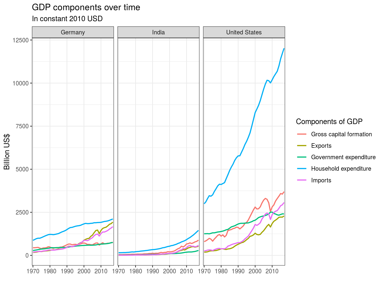
Checking for discrepancies
GDP_breakdown <- tidy_GDP_data %>%

  pivot_wider(names_from = IndicatorName,
              values_from = Value) %>%

  mutate(`Net Exports` = Exports - Imports,
         GDP_calculated = `Household expenditure` +
           `Gross capital formation` +
           `Government expenditure` +
           `Net Exports`,
         GDP_diff_perc = GDP_calculated/GDP_given - 1)
cat("Mean difference between calculated GDP and given GDP:\n",
mean(GDP_breakdown$GDP_diff_perc, na.rm = TRUE))## Mean difference between calculated GDP and given GDP:
## 0.00398We have approximately 0.40% mean difference between calculated GDP and GDP given across all countries (note that we excluded 42 countries because of missing indicators).
It goes without saying that one of they key factors affecting the changes visible on the graph is the stage of country development. Mature markets such as Germany and United States do not experience significant variations in GDP structure in comparison to India, which is an emerging market.
Government expenditures have been rather stable in Germany and India throughout the given period, however a significant decline could be observed in United States. This might be explained by the adoption of Keynesian approaches to crisis-management. Whenever a crisis occurs, the Federal Reserve pumps up enormous amounts of money into the economy through the government sector. Over the period, US GDP grew at a faster rate than government expenditure, which results in the decline visible on the graph. Higher percentage of government expenditure in Germany and United States than that of India could be explained by overall higher standard of living, which is the result of social benefits funded by governments.
We also observe an interesting relationship between household expenditures, net exports, and gross capital formation across given countries. Each country has its own story. India experienced significant GDP growth starting from 2000 onward, which was fueled by acquisition of assets increasing overall production output, which is shown on the graph by gross capital formation. Having seen the graph we can state that consumption level decreased (household expenditure) in favour of future investments. Furthermore, India experienced a trade deficit (negative net exports) which might be explained by its acquisition of foreign technologies, which ultimately contributed to GDP growth. On the other hand, German GDP growth at the beginning of the 2000’s was driven by export, which is reflected in the increase of net exports (trade surplus). Notably, the United States are one of the key recipients of German goods, which explains the US trade deficit that can be observed on the graph above (US negative net exports). Most US-imported goods are consumables, thus we can observe a slight increase in US household expenditure over the given period.
country_list <- c("South Africa","China", "India")
GDP_breakdown %>%
# filter for new country list
filter(Country %in% country_list) %>%
# select on columns needed
select(`Country`,
`Year`,
`Government expenditure`,
`Gross capital formation`,
`Household expenditure`,
`Net Exports`,
`GDP_calculated`) %>%
# calculate proportion
mutate(`Government expenditure` = `Government expenditure` / `GDP_calculated`,
`Gross capital formation` = `Gross capital formation`/ `GDP_calculated`,
`Household expenditure` = `Household expenditure`/ `GDP_calculated`,
`Net Exports` = `Net Exports` / `GDP_calculated`) %>%
# select everything but GDP for plot
select(-`GDP_calculated`) %>%
pivot_longer(cols = 3:6, names_to = 'IndicatorName', values_to = 'Value') %>%
# factorise indicators and specify order
mutate(IndicatorName = factor(IndicatorName,
levels = c('Government expenditure',
'Gross capital formation',
'Household expenditure',
'Net Exports'))) %>%
ggplot() +
geom_line(aes(x = Year, y = Value, group = IndicatorName, color = IndicatorName), size = 0.8)+
scale_x_discrete(breaks = c(1970,1980,1990,2000,2010)) +
scale_y_continuous(labels = label_percent()) +
scale_color_discrete(name = 'GDP breakdown') +
facet_wrap(~ Country) +
labs(title = 'China In Focus | Not All Emerging Markets Tell the Same Story',
y = 'Proportion',
x = '',
subtitle = 'GDP and its breakdown at constant 2010 prices in US Dollars',
caption = 'Source: United Nations') +
theme_bw()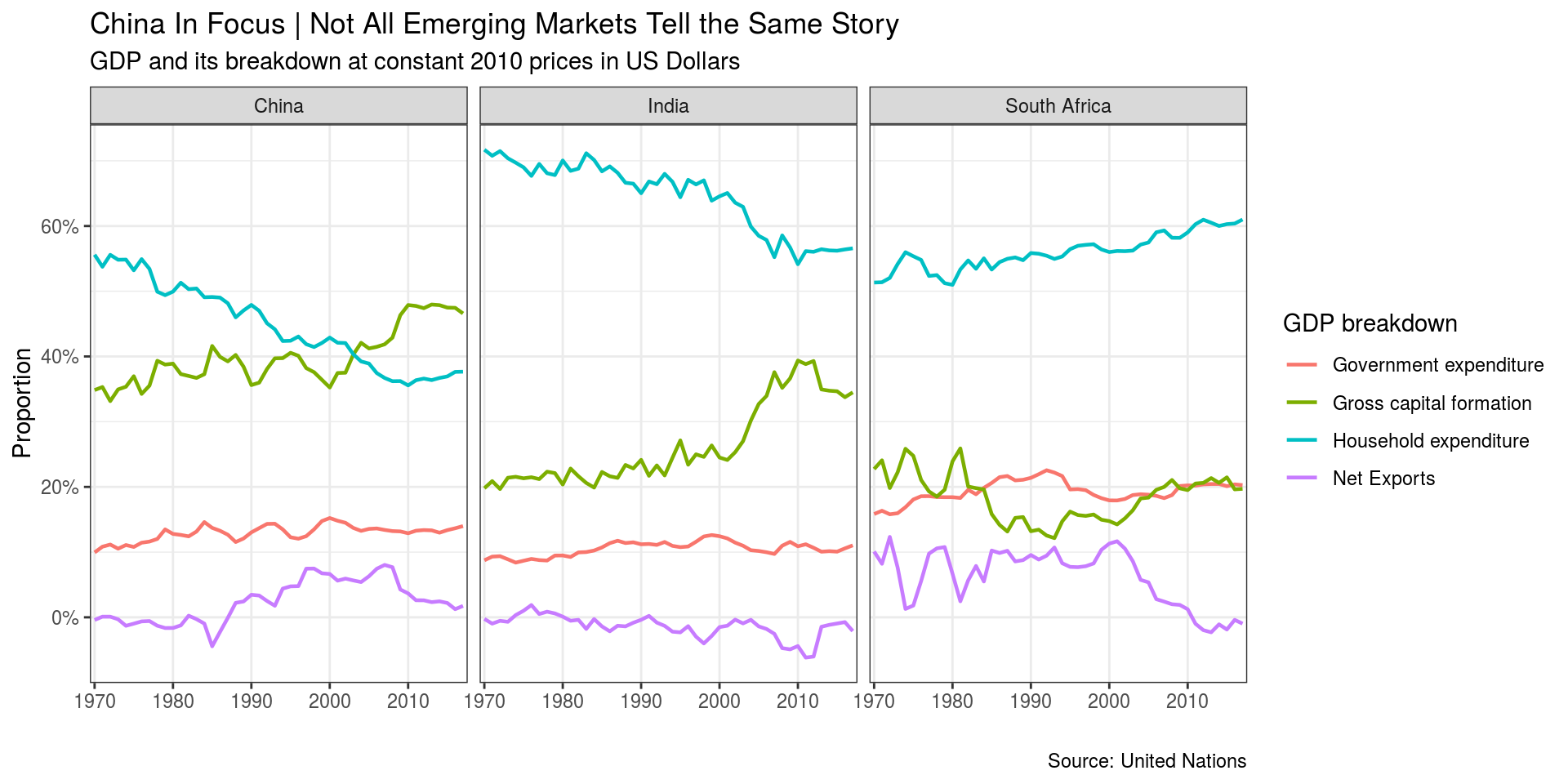 In this plot, we compared the GDP breakdown of three emerging markets. They have all seen little variation in the proportion of Government Expenditure, but significant changes in the proportion of other GDP segments.
Notably, China has seen a growing proportion of Net Exports in GDP between 1985 to 2005. This could be explained by the Reform and Opening-up policy in China, which attracted foreign investment and left a “World Made in China” image to the globe. Over the last 10 years, the growth of Chinese purchasing power has increased imports, leading to diminishing Net Exports. Further, Gross Capital Formation grew rapidly between 2000 and 2010, and now makes up more in GDP in China than either of the other two countries. This is partly because of continuous investment from home and abroad, as well as the return of Hong Kong (1997) and Macau (1999), which gave business investment another boost.